Red Rook Royal

The City of Denver and Instagram By on Nov 11, 2016

In another story filed under “Take and Keep Control of Your Social Media Accounts,” the City of Denver doesn’t know who is running the Instagram account.

Initially, this sounds like government bureaucracy at its best. An intern that no one in charge knows about is working in the bowels of city hall and is running the Instagram account — but that is not what is going on here. Essentially, someone set up an Instagram account years before the city got around to it and has done a good job. They regularly update, have engaging photos and have amassed 149k followers.

So what’s wrong with this since they aren’t besmirching the great city of Denver? The rub here is that the people who should be in charge of the message are unable to really communicate with their public. People see this great account and join to interact with it. The city is missing out on a great avenue to interact, get feedback, and build up their image. The best part is it is their own fault.

Sure, the city probably wasn’t super hip enough to join Instagram from the get go, but they should have parked an account several years ago. This is true for lots of groups — be they nonprofits, companies, or other corpora. If a social media channel is taking off go ahead and park an account. You don’t have to use it, despite what some will say, but it prevents you the headache of going through other channels to get it and being left behind in your own name space in the future.

I Voted By on Nov 8, 2016

Today is Election Day in America. Regardless of who wins, it appears that this election will have a very large turnout. That is great. It would be nice if everyone was always this involved in the political process.

As a result of the large turnout something you are likely to see nearly everywhere is the omnipresent “I Voted” sticker. These stickers have been given out since the 1980’s from local to national elections as a way to encourage voting. And it works. Not only does the sticker work as a memory jog to those who might forget that it is Election Day, but it also works as a societal pressure point. Furthermore, it has become a part of the American subconscious as people now immediately post their sticker selfies on social media sites like Facebook and Instagram.

The ubiquitous “I Voted” sticker shows that something simple can garner great marketing penetration. Companies don’t have to spend millions of dollars to change paradigms or disrupt markets. Corporations are not required to advertise on expensive legacy media channels. Rather they can do small things, and gain much better traction with the right message.

Free Basics in India or How Not to do Country-Wide Public Relations By on Feb 8, 2016

Today lots of American websites are focusing on the best Super Bowl commercial. However, I want to focus on a different topic taking place halfway around the world. This morning the Telecom Regulatory Authority of India, or TRAI, ruled against Facebook and their Free Basics service along with other zero rated services.

The main reason the TRAI voted against zero rated services was the perceived damage that they would do to net neutrality. While some websites would be free most would cost money to visit. Eventually, the theory goes, Facebook could control and restrict what the people of India could see on the internet.

The substance of the bill is not what I want to visit today though. What I want to focus on is the public relations and marketing for the bill.

Originally, Facebook had planned to get Free Basics, or Internet.org passed through lobbying discreet regulatory channels. This thing happens all the time in all kinds of governments. However, their plan got out and SaveTheInternet was born to combat it.

Interestingly enough, both camps first move was to appeal to net neutrality. This ended up being a mistake number one for Facebook as their product, while they may not intend to meter the internet, does not pass muster as a net neutral product. The second appeal both sides made was for public opinion. This was also a mistake for Facebook, as they failed to take into count the differences in culture and social influencers of India and the United States. It also focused attention on the regulators, who are not used to being in the limelight.

Finally, in a last attempt Facebook tried to discredit the local influencers by saying they were preventing the poor from accessing the internet and calling them names like internet ayatollah. This also back fired due to cultural reasons.

All-in-all, Facebook did a terrible job of relating to their publics. They misunderstood the issue as people saw it and failed to realize the way you communicate it differs depending on the audience. It will surely go down as a way not to do public relations on a large country wide scale. We should all learn from their expensive mistake.

Super Bowl 50 By on Jan 25, 2016

Every year the Super Bowl is one of the most watched programs. It draws all sorts of people, even those who do not normally watch sports programming, with its pageantry and shareable commercials.

This year, the NFL has been pushing the advertising and marketing of the Super Bowl extra hard as it is the 50th anniversary. This makes a lot of sense as prominent years are strong rallying points, shows brand strength, and are easier to sell. The build up to Super Bowl 50 has shown us ads with football history, talked about how football is family, and introduced the official sponsors.

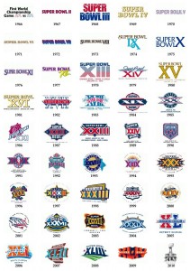
Super Bowl logos from 1966 to 2010.

The one thing that is missing though is a commercial that talks about the change from the traditional Roman numeral logos of the Super Bowl to the more familiar Arabic numerals this year.

I get it, the L does not work with some of the traditional logos, and certainly does not work with the recent trophy logo that has been repeated the last few years. More importantly, the letter L is usually associated with the opposite of sports prowess and what the Super Bowl represents.

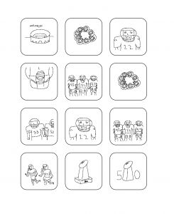
So below Red Rook Royal has put together a little storyboard and script for an explainer commercial of Super Bowl 50 (L).

superbowl50storyboard

Script

Frame 1. Establishing shot of Super Bowl crowd in the stadium


Frame 2. Secondary establishing shot of the team in pregame huddle

Player 1 (speaks in hoarse deep voice) – We are here at the Super Bowl! But we aren’t done.


Frame 3. Close up of player in huddle

Player 1 – Now we have to play tougher.


Frame 4. Super close up of player 1’s mouth

Player 1 – We have to run faster.


Frame 5. Medium shot of Player 1 in the huddle

Player 1 – We have to hit harder!


Frame 6. Back to over head huddle shot

Player 1 – Especially if we want to get that L!

Heads turn toward Player 1


Frame 7. Over the shoulder shot to Player 2

Player 2 – Uhh, don’t you mean the W?


Frame 8. Over the shoulder shot to Player 1

Player 1 – No, the big L!


Frame 9. Medium shot of Player 1 with team huddle in disbelief

Player 1 – It’s Super Bowl 50 and in Roman numerals that is a big fat L! Now lets go get that L!

Team cheers!


Frame 10. Medium shot outside the huddle as it breaks and player run towards the field


Frame 11. Super Bowl logo with an L pops up with field in background

Announcer – Super Bowl 50.


Frame 12. Canonical logo of Super Bowl 5o fades in

Announcer – The only time any team has ever wanted an L.


*All trademarks are owned by their respective owners. Red Rook Royal is not associated with the NFL, the teams, or their companies. We just thought this was an interesting concept.

Farmington Church of Christ: Logo in Action By on Jan 19, 2016

I enjoy designing logos. One of my favorites that I have recently done is the Farmington Church of Christ logo. Not only is it simple but it ties together the building’s architecture with the church’s mission.

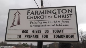
The Farmington Church of Christ sign with the logo Red Rook Royal created for them.

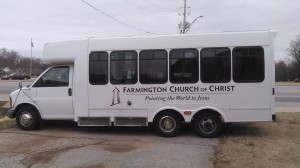
The church uses the logo on all their letterhead, invitation cards, and signage through out the building. It also uses the logo outside the building on the sign that faces the highway and the church bus.

Farmington Church of Christ bus with logo that Red Rook Royal created for them.

Ozark Ultimate Magazine By on Jan 7, 2016

During college I fell in love with a sport called ultimate. I was pretty decent at it and enjoyed challenging myself to constantly get better. That was back in 2001, and at the time there wasn’t much in the way of ultimate news — except what the Ultimate Players Association would put out in their quarterly magazine and some old message boards.

In 2004, I used what I had learned of html  and newspaper writing to make a blog on the blogger platform. It did fairly well and was decently read. I kept it up through my graduate studies, but found myself with little time after entering the job force.

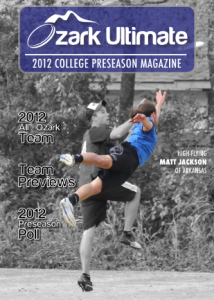
Several years later in 2011, after working in Washington D.C. as a Public Relations Manager, I rebooted the blog as a full blown news site as there was still precious little information about ultimate news. In an effort to monetize the site and make it self-sufficient, I made a digital preseason magazine for the 2012 year along with video sales and ad display. The magazine was integrated into the website’s store and was delivered digitally via cloud server.

The magazine was profitable, selling over 200 copies in a nascent niche. Unfortunately, Ozark Ultimate was hamstrung as my time was required at Red Rook Royal and competitors with a national focus sprang up. However, its legacy and initial goal of bringing timely news to a quickly growing sport were effective.

*While the original was digitally delivered, it was in pdf and flash format. The pages from the version below are unchanged from the original. However, it is now in html 5.0. March of progress and all.

View the 2012 Ozark Ultimate Preseason Magazine.

Ozark Ultimate Magazine Cover

Tulip Mania and the App Boom By on Jan 5, 2016

In the 17th century Holland was very suddenly a rich and powerful country. Positioned as a world trade leader, wealth flowed through her many ships. At the same time, tulips from explorations in modern day Turkey were brought back and readily grew in the cold and boggy climate the Dutch called home.

Tulips were very unusual at that time with their bold color. They quickly became a status symbol for the nouveau riche. Estates of bright color were planted all over the land. But tulips are slow to cultivate and that created a great demand with a small supply. Eventually, prices sky rocketed. Many people made and lost fortunes over night — all over tulip bulbs. The mania would not last as prices crashed over a four month period in 1637. Thus ended the first speculative boom.

Currently, there is a similar boom in the app market. People are throwing apps, both good and bad, into the market because they heard that you can make quick money that way. And it is true, you can. But what happens when the bubble pops? How can you ensure that you app will succeed in the post-app boom future?

First of all you need to figure out if you need an app. Are you creating an app for your ego? Because everyone else is doing it? What if it will help others or your business achieve measurable metrics?

Secondly, you need to know your market and how you will be able to get people to download your app. It doesn’t matter how awesome your app is if no one knows about it or it doesn’t solve a problem. With all the new apps being uploaded every day how will users find out about it?

Finally, differentiate yourself. There is a big difference between having an app and having an app that is user friendly and works. Unscrupulous app designers will throw something up to make a quick buck and move on, but real designers need to make apps that are useful and a joy to use. If people enjoy your app it helps drive new downloads via word-of-mouth and future users.

The Mobile Web vs Native Apps By on Jan 4, 2016

We are in the midst of a revolution, and like most midsts of most revolutions, it’s really messy and unsettled. It’s crazy times.

Should you support the Mobile Web party, the party of freedom and interoperability and keeping-things-simple? Or the Native App party, the party of walled gardens and specific platforms and easy monetization? The answer is: You can support both at the same time. Compromise!


Platforms and Dependencies

The web is platform-independent. Well, more accurately, it’s supported by lots of different platforms who are all converging on a set of standards that means you don’t have to change things too much. This means you can make your application once, and run it most places, with maybe some tweaks here and there to match specific circumstances.

Native apps, in contrast, are platform-specific. In one sense, this can be handy, because if the platform is constrained enough, like say iOS on an iPhone, you can make your app pixel perfect for the device. Of course, the unhandiness creeps in immediately, because if you want to market your app to people who don’t use iPhones, you’ll have to port the app, and then do a whole new set of pixel perfect optimizations.

There’s another, and pretty significant, upside to focusing on the web: a mobile app can’t replace your website for all of your desktop users, because of that platform-dependence thing. This means that you’ll need to maintain two or more different products, sometimes for the same sets of users. A well-designed website is both mobile- and desktop-centered, eliminating the need to have multiple development streams.


Speed

Native apps are often perceived to be faster, especially in some absolute, abstract sense. This isn’t necessarily true: most apps don’t need fancy graphics and so can’t be slowed down by complicated animations; and anyway those fancy animations depend more on the browser than some absolute limit.


Offline-ness

If there’s one thing that native apps do better than mobile web, it’s being available when there’s no network. Or rather, it’s being known to be available when there’s no network. It’s actually not that hard to save websites for offline use on a mobile device. This doesn’t mean that all people know how to do it.

There’s a more pressing issue related to this, though: browsers can limit how much of a website is stored for offline use. If you have a real need to let users store large amounts of data on their mobile devices for offline use, it may be reasonable to pursue a native app.


Discovery and Monetization

Native apps seem easier to discover, from the perspective of using a distributor storefront like the Apple App Store, and easier to charge for, from that same perspective. But a mobile web app can be found through any browser, and it’s not as hard as you might think to charge for access.


All Together Now

I might seem pretty hard on native apps, but I’ll say it: native apps have their uses, and they might even be a good choice for your application. Even better: there’s all sorts of development that makes it possible to put your website, which will be mobile web ready, of course, into a little piece of native app, to get the best of both worlds, and to capture all sorts of customers, no matter what their preferences. Now doesn’t that sound like a win-win?

Happy 2016! By on Jan 1, 2016

Happy 2016! We at Red Rook Royal hope that 2015 was a blast and that 2016 will be even better. Here’s to new websites, logos, and press releases.